Colours
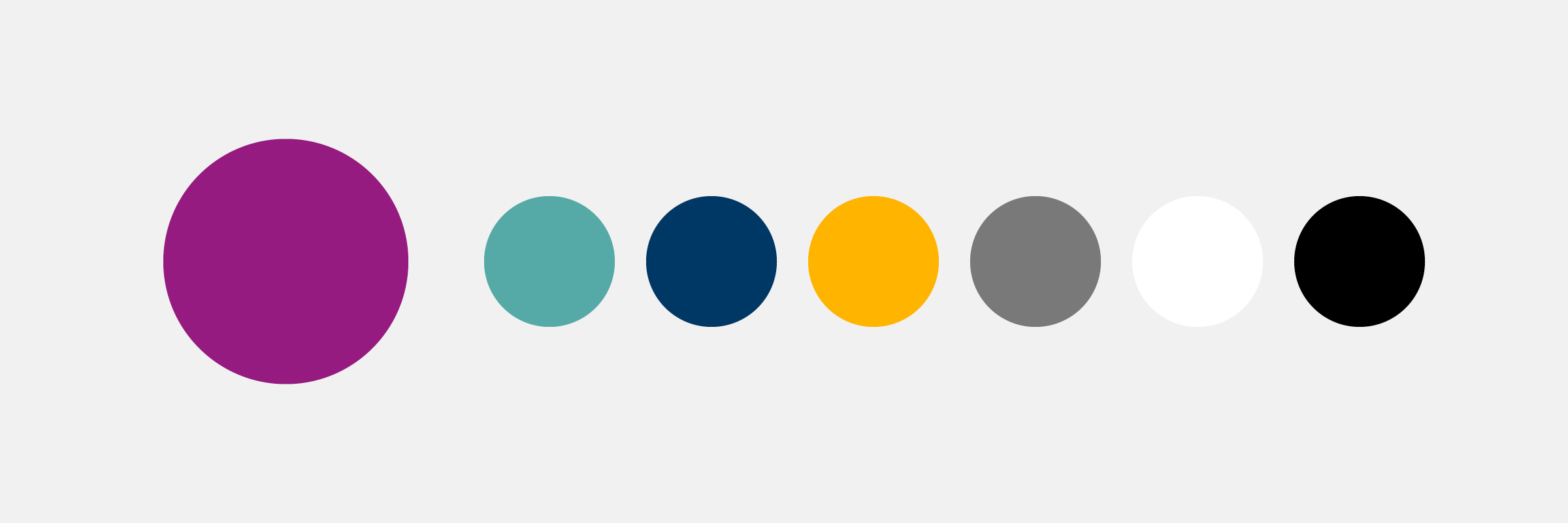
Jönköping University brings together people from all over the world. Together, we colour life and make Jönköping University a colourful place of learning. Our base is purple, to which we add turquoise, dark blue, yellow, grey, black and white spices. The palette is common to the entire university.
Identity colour
Our identity colour is purple. It is particularly important in our work to convey our identity and brand. When we use the colour purple, we create recognition and stand out amongst other senders.
The profile colour can be used in different shades. We have developed colour codes for three lighter shades (-80, -50 and -20) and one darker (+20)
Purple – main colour
Purple – main colour
Purple – shades
Purple (–80)
Purple (–50)
Purple (–20)
Purple (+20)
Complementary colours
Turquoise, dark blue, yellow and grey are our complementary colours. Together with our identity colour, we use them, to different extents, to convey a sense of Jönköping University.
Each complementary colour has three lighter shades (-80, -50 and -20).
Turquoise
Turquoise – main colour
Turquoise (–80)
Turquoise (–50)
Turquoise (–20)
Dark blue
Dark blue – main colour
Dark blue (–80)
Dark blue (–50)
Dark blue (–20)
Yellow
Yellow – main colour
Yellow (–80)
Yellow (–50)
Yellow (–20)
Grey
Grey – main colour
Grey (–80)
Grey (–50)
Grey (–20)
White and black
White
Black
Font color
In flowing text such as headings, preambles and body text, we mainly use black, white and purple. Keep in mind that the colour chosen for the text should be legible against the background.
Black
Black (–80)
White
Purple
Purple (+20)